After loading the database, the database objects (tables, views, custom views, reports and linked tables) will be shown in the left pane (the database pane). Click on any table to go to the Field Setup Page for that table at any time.
PHPMaker support most commonly used data types. If PHPMaker finds any unsupported fields in a table, an Unsupported Fields tab will appear. You can click on the tab to view the list of fields that are not supported.
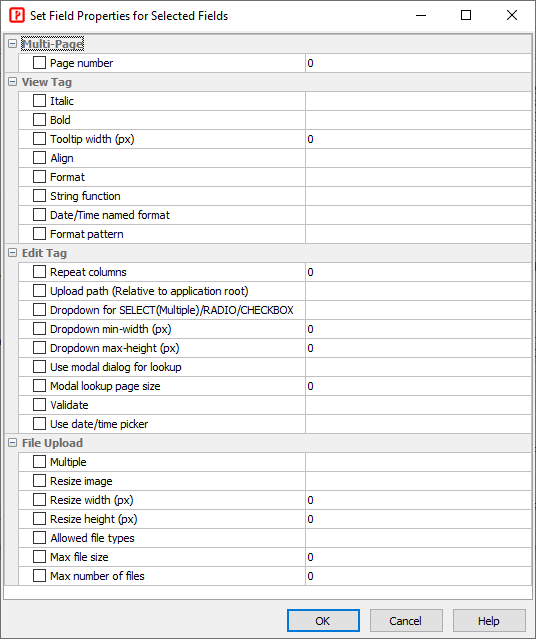
The Field Setup pages consists of two section. The upper section is a grid showing available options of all fields. The lower section contain two panels, the Edit Tag panel and the View Tag panel for the selected field.
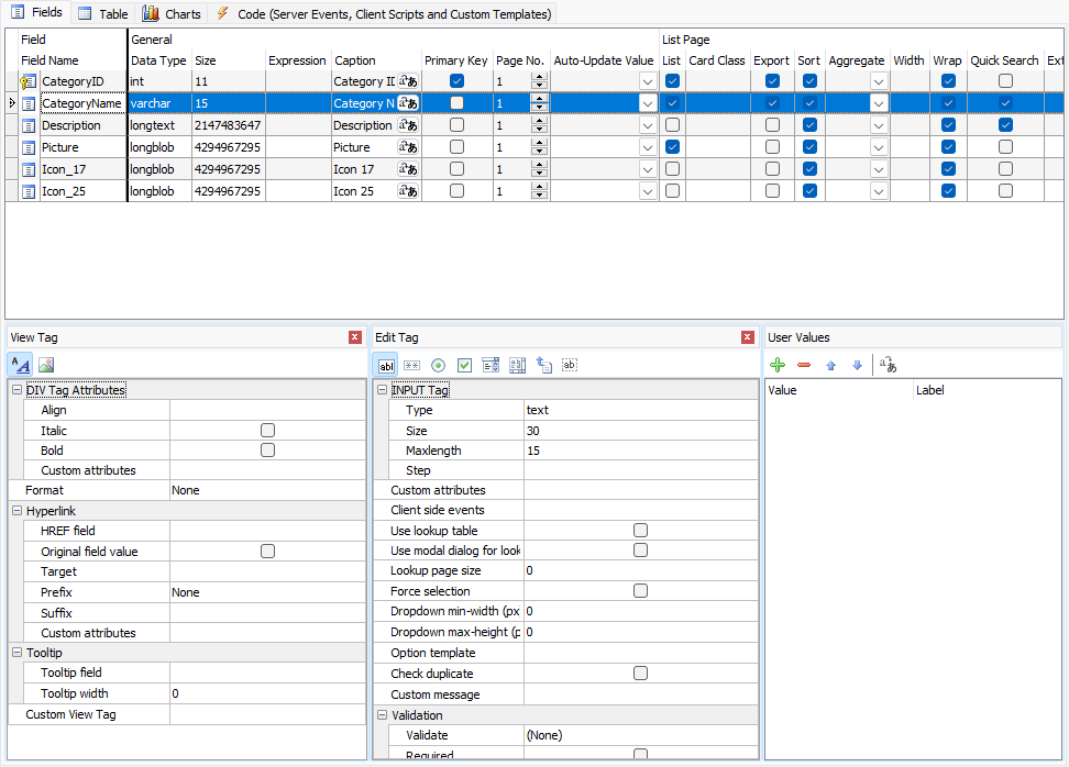
The grid consists of the following sections:
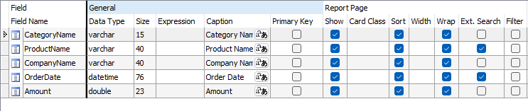
General
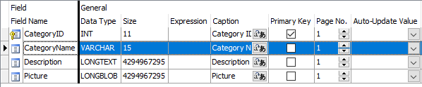
| Field Name | Field Name (read only). You can select multiple fields by ctrl-clicking or shift-clicking field name(s) in this column and do the follows:
Change Field Display Order by Drag-and-Drop Change Multiple Field Properties |
| Data Type | Data Type (read only) |
| Size | Maximum field length (read only) |
| Expression | The expression for custom field (Custom Fields only). See also Custom Fields. |
| Caption | Field caption to be displayed |
| Primary Key | Primary Key of the table. Composite key is supported.
Important
You should use the same primary key as declared in the database, do not change it unless
you are absolutely sure that the selected field(s) values are unique. Otherwise a record cannot be located properly and unexpected results may occur.
|
| Page No. | Page number of the field. For use with Multi-Page. By default all the fields are in page 1 and Multi-Page is disabled.
Multi-Page is supported for Add/Edit/View/Search pages, you can optionally enable it for each page. Page labels are also supported. See Table Setup. If Multi-Page is enabled and the page number is 0, the field will appear in all pages. Note You can multi-select the fields by ctrl-click or shift-click the Field Name column and then right click to set the page number for the selected fields simultaneously.
|
| Auto-Update Value | A dynamic value to update the field automatically in Add/Edit pages.
The dropdown list for this setting is preloaded with a few functions for your selection. For example, you may want to record the last modified date of a record, then you can select "CurrentDate". Do not select a function that return values of unmatching data type, for example, you should not select a function that return a non-numeric string for a numeric field. Notes
|
List Page
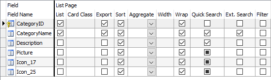
| List | Show field in list page
Note The setting is also used for Inline/Grid-Add/Edit and Master/Detail-Add/Edit/View. |
||||||||||||
| Card Class | CSS class for the field in Multi-column List page. In a Multi-Column List page, each page is shown in a Bootstrap Card. Bootstrap supports card-* classes for contents in cards (see Content types), if not used, fields are shown in a regular format with both caption value. If card-* classes are used, the data can be shown more nicely, e.g.
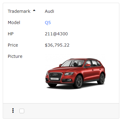
Card without card-* classes 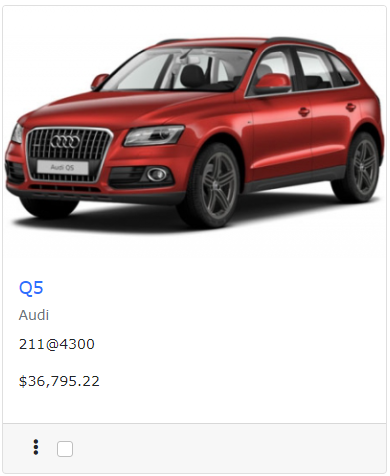
Card with card-* classes The following card-* classes are supported: Note Field with the following class will be shown without caption.
|
||||||||||||
| Export | Include the field when export | ||||||||||||
| Sort | Allow sorting by clicking the column header | ||||||||||||
| Aggregate | Enable field aggregate. Aggregated values will be shown at table
footer. Not applicable in Multi-Column view. Supported values are:
|
||||||||||||
| Width | Specify CSS width property for field column width. Number, number with unit, or CSS styles are supported, e.g.
Note If your table is too wide, browsers will try to best fit the content into screen and the specified width may be overridden. |
||||||||||||
| Wrap | Enable/Disable text-wrap for field value. If enabled, style white-space: nowrap; will be added to the table cell.
Note If you enable text-wrap but the field value has no line-breaking points (e.g. spaces or punctuation), the text still cannot be wrapped. |
||||||||||||
| Quick Search | Include this field when performing Quick(Basic) Search in the List page.
Note Only text fields and numeric fields are supported in Quick Search. By default only text fields are enabled. |
||||||||||||
| Ext. Search | Use this field in Extended Quick Search
Extended Quick Search is enhancement of Quick Search. If a field is checked for Ext. Search, a form element for the field will be shown in the Quick(Basic) Search form and the user input criteria for this field will be included when performing Quick(Basic) Search. Extended Quick Search will use the same search operators specified under the "Advanced Search Page" section (see below). Note Extended Quick Search only works with field selected to show in the List page or the search criteria cannot be highlighted (if enabled, see Table Setup) and may confuse some users. |
||||||||||||
| Filter | Enable table header filter. If enabled, an Excel style filter will be enabled in the table header of the column, e.g.
Note This setting is mutually exclusive with Ext. Search. If both are enabled, Filter will be used.
|
View Page
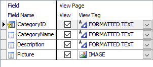
| View | Show field in View page |
| View Tag | HTML tag to display the field for viewing (see below for details). Used in List/View pages. You can either click the [View Tag] column and select a View Tag from the drop down box or click the icon on the View Tag panel toolbar to select. After selecting the View Tag, you can further setup its properties in the View tag panel. |
View Tag
There are two types of View Tag, Formatted Text and Image.
Formatted Text - View Tag to display the field value as formatted text with optional hyperlink.
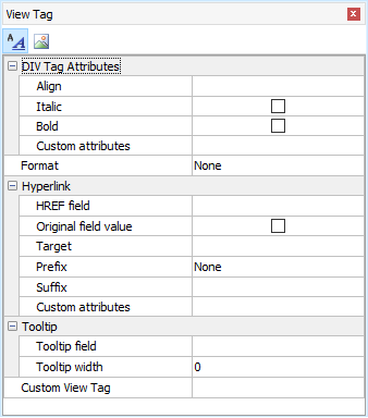
DIV Tag attributes |
|||||||
| Style | Align - Left/Center/Right/Justify. Align the data. Italic - Display as Italic Bold - Display as Bold |
||||||
| Custom Attributes | Other custom attributes for the <div> or <span> tag. For example, you can enter as string, e.g. (string with single/double quotes)
"onmouseover='my_js_function();' onmouseout='my_js_function2();'" or preferably as an array, e.g. ["onmouseover" => "my_js_function();", "onmouseout" => "my_js_function2();"] Notes
|
||||||
Format |
|||||||
| None | No format | ||||||
| Currency | Display as formatted currency, format based on locale settings | ||||||
| Date/Time | Display as formatted date. Possible values of Date/Time named format are:
where
Notes
|
||||||
| Number | Display as formatted number, format based on locale settings | ||||||
| Percent | Display as formatted percentage, format based on locale settings | ||||||
| Format pattern | Custom format pattern for "Currency", "Date/Time", "Number", "Percent". If the default locale pattern does not suit your need, you can enter your custom format.
For "Currency", "Number", "Percent", use ICU DecimalFormat (see the Patterns section for complete information) and Tools -> Locale Settings. For "Date/Time", use ICU Date/Time Format Syntax.
Note If custom format pattern is specified, it will also be used during editing. Users must input in the same format or the input values cannot be parsed to valid values for databases.
|
||||||
| String | Format the field value with specified PHP string function (e.g. strtolower) or custom function.
If the string function name is not listed in the dropdown, you can enter your own function name. If the function has one argument only, the argument must be the field value and you only need to enter the function name, e.g. strtolower. If the function has more than one arguments, use {value} to denote that field value, for example, to format a date field by PHP date function, enter: date(DATE_RFC822, strtotime({value})) If you want your own functions to be selectable in the dropdown, you can add your function to the following registry: e.g. StringFunctions=MyFunction1,MyFunction2 You can put your functions in server side Global Code section, see Server Events and Client Scripts. |
||||||
| Replace CR+LF by <BR> | Display the fields with CR+LF replaced by <BR>
Note This setting only applied to memo fields. |
||||||
| Max Length (List page) | Truncate the field value at specified max. length and append "..." to the end.
Note This setting only applied to memo fields in list page and must be larger than 0 to take effect.
|
||||||
Hyperlink |
|||||||
| HREF field | Display the field as hyperlink with the href attribute set to the value of this field. It can be the field itself. | ||||||
| Original field value | Use original field value of the Href field in the hyperlink instead of display field value.
If the HREF field has lookup table or user values, by default the display value will be used. If this option is enabled, the original field value will be used instead. |
||||||
| Target | Target attribute of the hyperlink. Possible values are: _top, _parent, _self, or _blank. You can also enter your own. | ||||||
| Prefix | Prefix added before the HREF field value. You can select one of the options (e.g. "https://"), or you can enter your own partial URL (preceding the HREF field value).
Note This setting is a string to be quoted by double quotes, if you want to use PHP variable, wrap it in { and }. Since { can not be escaped, this syntax will only be recognized when the $ immediately follows the {. Read PHP Strings for more information on parsing variable in string.
For example, you can enter: (no quotes) mypage?id= The value of the HREF field will be appended to the end of the your prefix in the outputted HTML. If you want pass a field value, you can enter: (no quotes) mypage?myfield={$this->urlEncode($this->MyField->CurrentValue)}&id= If you need to pass parameters which should not be URL-encoded, for example, if you use Encrypt() to encrypt your parameter, you can enter: (no quotes) mypage?myfield={$this->raw(Encrypt($this->MyField->CurrentValue))}&id= |
||||||
| Suffix | Suffix added after the HREF field value. You can use this setting to append additional URL parameters.
For example, you can enter: (no quotes) &field2={$this->urlEncode($this->Field2->CurrentValue)} Note If the suffix is URL parameter(s), you should use & at the beginning of the string.
|
||||||
| Custom Attributes | Custom attributes for the <a> tag.
For example, you can enter a string, e.g. (string with single/double quotes) "rel='xxx'" or preferably as array, e.g. ["rel" => "xxx"] Notes
|
||||||
Tooltip |
|||||||
| Tooltip field | Display the field as tooltip | ||||||
| Tooltip width | The width of the tooltip in pixels. Default is 0 (auto).
By default the width is not specified and the width will depend on the field value. However, when the tooltip field is a long text field, the width can take up the browser width, which may be unwanted. Then you can specify a value to limit the width. |
||||||
Custom View Tag |
|||||||
| Custom View Tag | Display the field value in List/View page by custom code.
Important Custom View Tag overrides ALL above View Tag settings.
There are some ready-to-use Custom View Tag for you to choose:
If your data stores information for above, just click the down arrow button to open the setup form, enable one of them, read the notes at the bottom panel carefully, then click the Settings tab to setup, and click OK to save your settings.
Notes
You can create your Custom View Tag, they are implemented in exactly the same way as extensions. If your code is simple and you don't bother creating a Custom View Tag for reuse, you can enter your code directly. Click the [...] button to enter your own code to display the your data in your own PHP, HTML and JavaScript. Important If you choose to enter your own code, you are completely on your own to display the field value. Intermediate knowledge in PHP, HTML, CSS and JavaScript is required.
Custom View Tag is HTML, if you want to embed PHP code, use <?php and ?>, if you want to use JavaScript, use <script> and </script>. Note DO NOT use $this in your PHP code. There is no $this in the context, you can use CurrentPage() to get the current page object.
Custom View Tag supports the following tags:
The above tags are just some helper tags, you can write your own Custom View Tag without using them at all. Example Output the field value conditionally: Example Output a custom link: |
||||||
Image - View Tag to display data as image or PDF. (Other file types will only be displayed as hyperlinks.) The field should be a BLOB field or a field storing the path of a file.
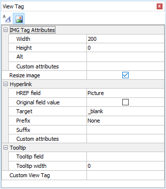
| IMG Tag attributes (For images only) | |
| Width | Specify the width of the image in pixels |
| Height | Specify the height of the image in pixels |
| Alt | Specify the alt attribute of the image tag
Note If you use Multi-Language (see PHP Settings), use Multi-Language Property Editor, see Tools for details. |
| Custom attributes | Other custom attributes for the <div> or <span> tag. For example, you can enter: (string with single/double quotes)
"onmouseover='my_js_function();' onmouseout='my_js_function2();'" or ["onmouseover" => "my_js_function();", "onmouseout" => "my_js_function2();"] Notes
|
| Resize image | Resize the image to above width and/or height on displaying the image.
Note This feature requires PHP GD extension and supports GIF, JPEG and PNG images only.
|
| Hyperlink, Tooltip and Custom View Tag (same as above) | |
Edit Page
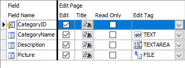
| Edit | Show field in edit page
Note The setting is for Edit page only, NOT for Inline/Grid-Add/Edit and Master/Detail-Add Edit in the List page. See the List setting above. |
| Title | Title to be placed in title attribute of Edit Tag. (see section below) The title will also appear as popup tooltip of the Edit Tag.
Note If you use Multi-Language (see PHP Settings), use Multi-Language Property Editor, see Tools for details. |
| Read Only | Make the field read only in edit page
Note This setting replaces the Edit Tag by a INPUT type=hidden tag and show the field by its View Tag (see above). If you want to set the Edit Tag's readonly attribute (supported by INPUT type=text, INPUT type=password, TEXTAREA), use Row_Rendered server event. If you want to set the Edit Tag's disabled attribute, you can set $this-><field>->Disabled property. (See Server Events and Client Script.) |
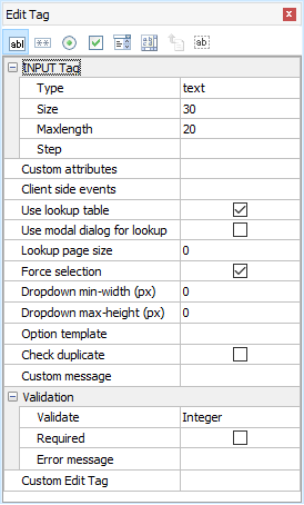
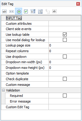
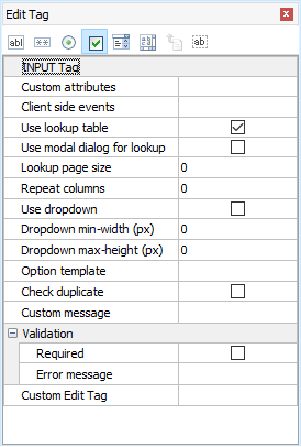
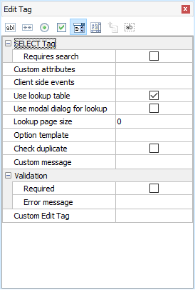
| Edit Tag | Form element for the field. Use in Add/Copy/Edit/Search pages (see below for details). You can either click the [Edit Tag] column and select a Edit Tag from the drop down box or click the icon on the [Edit Tag] panel toolbar to select. After selecting the Edit Tag, you can further setup its properties in the Edit Tag panel. |
Edit Tags are HTML forms elements for the field in Add/Copy/Edit/Search pages. All HTML form elements are supported:
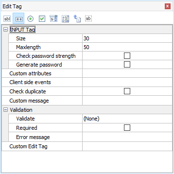
| Text | <input type="text"> tag Display the field as a textbox.
|
||||||||||||||||||||||||||||||||
| Password | <input type="password"> tag Display the field as a masked textbox.
|
||||||||||||||||||||||||||||||||
| Radio | <input type="radio"> tag Display the field as a radio button list.
|
||||||||||||||||||||||||||||||||
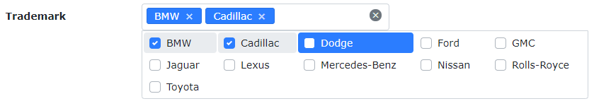
| Checkbox | <input type="checkbox"> tag Display the field as a checkbox list.
Note For MySQL, PHPMaker considers enum('Y','N') and enum('1','0') as boolean fields. For Oracle, fields with two and only two User Values (see below) and the labels and values are "Y" and "N" (or "1" and "0") will be considered as boolean fields. PHPMaker will display a boolean field by a checkbox automatically.
Note The submitted values of the multi-selected checkboxes is a comma-separated string. Therefore you must use a string field
for checkbox list. |
||||||||||||||||||||||||||||||||
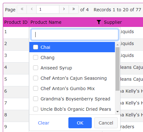
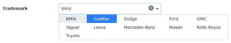
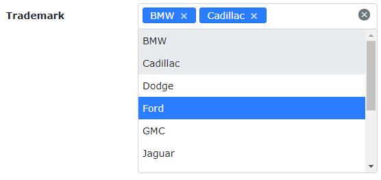
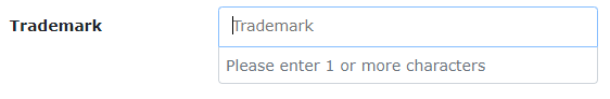
| Select | <select> tag Display the field as a dropdown selection list.
Note By default Select2 will be used for <select> tags. However, you can choose to use native <select> tags for single selection (select-one) fields, see the option Use native SELECT tag for select-one fields in Advanced Settings.
|
||||||||||||||||||||||||||||||||
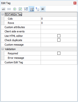
| TextArea | <textarea> tag Display the field as a textarea.
|
||||||||||||||||||||||||||||||||
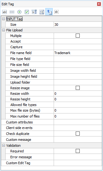
| File | <input type="file"> tag Display the field as a file upload control. For BLOB fields or string fields only. By default jQuery File Upload and drop zone will be used and the file input tag will be shown as:
If you don't want to use drop zone and display field as Bootstrap File input, you can disable the option Use drop zone for file upload fields in Advanced Settings. Note File upload supports displaying thumbnails of uploaded image. The feature requires PHP GD extension and supports GIF, JPEG and PNG images only.
If the field is of BLOB (binary) data type, file is uploaded to the database. You can also store the information of the uploaded file in the following fields: (for BLOB field only) File type field - Optional. Useful when you want to response to user browser the exact content type of the data. File name field - Optional. Useful if you want to use the original filename. File size field - Optional. Stores the uploaded file size. Image width field - Optional. For use with images only. Stores the width of the uploaded image. Image height field - Optional. For use with images only. Stores the height of the uploaded image. If the field of string type, file is uploaded to a subfolder relative to the project folder. Multiple - Allow multiple upload, see multiple for details. Field value will be comma separated file names. Not applicable to BLOB field. Accept - The accept attribute defining the file types the file input should accept. Capture - The capture attribute value is a string that specifies which camera to use for capture of image or video data, if the accept attribute indicates that the input should be of one of those types. Upload folder - Folder where the uploaded file will reside. If unspecified, all the uploaded files will be put in the global upload folder specified in the PHP tab (see PHP Settings). Notes
Resize image - Optionally resize the image to resize width and/or height. Resize width - Width of the resized image Resize height - Height of the resized image Note Resizing requires PHP GD extension and supports GIF, JPEG and PNG images only.
Allowed file types - Comma separated file extensions (e.g. jpg,png,gif) without spaces and quotes. If not specified, the global setting (see PHP Settings -> General Options -> File Upload) will be used. Note For security, the field-specific Allowed file types must be included in the allowed file types under PHP Settings -> General Options -> File Upload.
Max file size (bytes) - The maximum allowed file size in bytes. (Requires browsers supporting the File API.) If not specified, the global setting (see PHP Settings -> General Options -> File Upload) will be used. Max number of files - The maximum number of files that are allowed to be uploaded if Multiple (see above) is enabled. It must be larger than 1. (If you just allow one file, disable Multiple.) If not specified, unlimited file uploads are allowed. Since file names are stored as comma separated value in the field, the max number of files is also limited by the field size defined in the database. |
||||||||||||||||||||||||||||||||
| Hidden | <input type="hidden"> tag Hide the field with a hidden form element.
Note This is different from de-selecting the field in the Edit column. If a field is de-selected, no code will be generated for the field in the Edit page and the field will not be updated. With a hidden form element the field is not seen but it may still get updated.
Custom value - by default the 'value' attribute contains the field value, custom value is used to update the field with another value when a record is updated using the Edit page. Notes
Custom attributes - same as above (see Text Edit Tag) |
||||||||||||||||||||||||||||||||
Custom Edit Tag |
|||||||||||||||||||||||||||||||||
| Custom Edit Tag | Display the field value in Add/Edit/Search pages by custom code.
Important
To use Custom Edit Tag, click the down arrow button to open the setup form, enable one of them, read the notes at the bottom panel carefully, then click the Settings tab to setup, and click OK to save your settings. You can create your own Custom Edit Tag, they are implemented in exactly the same way as extensions. If your code is simple and you don't bother creating a Custom Edit Tag for reuse, you can enter your code directly. Click the [...] button to enter your own code to display the your data in your own PHP, HTML, CSS and JavaScript. You can enter JavaScript and stylesheet paths under Tools -> Scripts & Stylesheets. Note that the paths are global for the whole project, not just for a field, you'll see JavaScript and stylesheet paths required by other fields. Custom Edit Tag is HTML and PHP, if you want to embed PHP code, use <?php and ?>, if you want to use JavaScript, use <script> and </script>.
Note DO NOT use $this in your PHP code. There is no $this in the context, you can use CurrentPage() to get the current page object.
The following special tags are supported:
|
||||||||||||||||||||||||||||||||
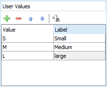
Using User Values for Edit Tag (Radio/Checkbox/Select)
For Radio/Checkbox/Select Edit Tags, the default option values are user input values, you can enter as many value/label pairs as you want in the User Values panel next to the Edit Tag panel.
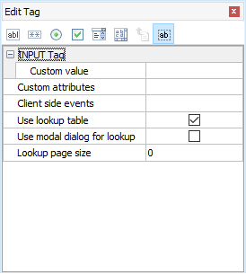
Using Lookup Table for Edit Tag (Text/Radio/Checkbox/Select)
In real world applications, the option values usually come from a lookup table in the database. PHPMaker make it very simple to use lookup values for key field values, simple click Use Table, the Lookup Table panel will replace the User Values panel, see Lookup Table for details.
Dynamic Selection Lists
PHPMaker supports Dynamic Selection Lists in which child lookup fields' selection list options change dynamically based on option selected in the parent selection list. To setup child lookup fields, click the Child lookup fields... button and the following setup form will be displayed:
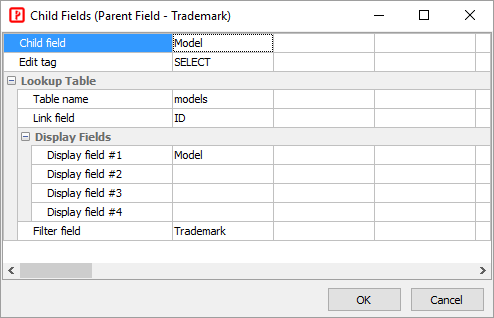
Read Tutorial - Dynamic Selection List for more information.
Client side events (for Add/Copy/Edit/Search)
You can manipulate fields on the client side quickly with PHPMaker's "fields" jQuery plugin (see Server Events and Client Scripts).
Example 1
Set field values based on current field value
Example 2
Client side calculation based on user input
Validation (for Add/Copy/Edit/Search)
The data input for each field can be validated using client-side JavaScript.
| Validate | Supported validation formats are:
Notes
|
| Arguments (Client-side) | Arguments for the JavaScript functions for validation. For Regular Expression and custom validation functions only.
Note This is JavaScript arguments, it should be comma separated (if more than one) JavaScript expressions. e.g. If it is a string, it must be single or double quoted.
If the Validate setting (see above) is Regular Expression, this setting must be a valid JavaScript regular expression pattern along with flags that identify how to apply the pattern (delimit the pattern by "/" characters, not single or double quotes), e.g. /foobar/i See Creating a Regular Expression for more information about the pattern and flags. |
| Arguments (Server-side) | Arguments for the PHP functions for validation. For Regular Expression, "Assert" validators and custom validation functions only.
Note This is PHP arguments, it should be comma separated (if more than one) PHP expressions. e.g. If it is a string, it must be single or double quoted. You can explicitly specify argument names to skip or reorder arguments.
If **Regular Expression**, arguments must be the pattern to search for, **as a single or double quoted string**, e.g. '/foobar/i' See PHP function preg_match for more information about the pattern. |
| Use date/time picker | Check this option to use a JavaScript date/time picker instead of manual input.
Notes
|
| Required | Check this checkbox if the field is mandatory.
Notes
|
| Error message | Enter the error message to show if error occurs. Note that this error message is only used for client-side validators and the following server-side validators: Integer, Float, Date, Time. For other server side validators, the "Assert" Validators and the translation file *validators.en.php* will be used. If you use non-English languages, you need to create your *validators.\ Note If you use Multi-Language (see PHP Settings), use Multi-Language Property Editor, see Tools for details. |
Add Page
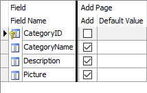
| Add | Show field in add page
Note The setting is for Add page only, NOT for Inline/Grid-Add/Edit and Master/Detail-Add Edit in the List page. See the List setting above. |
| Default Value | Default value for field (for adding new record only) .
The value must be a valid PHP expression. (If it is a string, must be single or double quoted.) |
Advanced Search Page
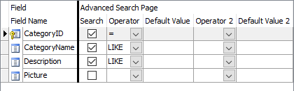
| Search | Show field in Advanced Search page (Note: NOT related to Quick Search) |
| Operator | Search operator #1 for the field. Used in Advanced Search or Extended Quick Search. |
| Default Value | Default value for Search Opr 1.
The value must be a valid PHP expression. (If it is a string, must be single or double quoted.) |
| Operator 2 | Search operator #2 for the field. Used in Advanced Search or Extended Quick Search.
Notes
|
| Default Value 2 | Default value for Search Opr 2 .
The value must be a valid PHP expression. (If it is a string, must be single or double quoted.) |
| Show | Show field in report page | ||||||||||
| Sort | Allow sorting by clicking the column header. (Not all fields are sortable.) | ||||||||||
| Width | Specify CSS width property for field column width. Number, number with unit, or CSS styles are supported, e.g.
Note If your table is too wide, browsers will try to best fit the content into screen and the specified width may be overridden. |
||||||||||
| Wrap | Enable/Disable text-wrap for field value. If enabled, style white-space: nowrap; will be added to the table cell.
Note If you enable text-wrap but the field value has no line-breaking points (e.g. spaces or punctuation), the text still cannot be wrapped. |
||||||||||
| Ext. Search | Use this field in Extended Quick Search. If a field is checked for Ext. Search, a form element for the field will be shown above the report for searching the report. | ||||||||||
| Filter | Enable table header filter. If enabled, an Excel style filter will be enabled in the table header of the column |
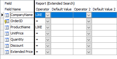
| Operator | Search operator #1 for the field. Used in Advanced Search or Extended Quick Search. |
| Default Value | Default value for Search Opr 1.
The value must be a valid PHP expression. (If it is a string, must be single or double quoted.) |
| Operator 2 | Search operator #2 for the field. Used in Advanced Search or Extended Quick Search.
Notes
|
| Default Value 2 | Default value for Search Opr 2 .
The value must be a valid PHP expression. (If it is a string, must be single or double quoted.) |
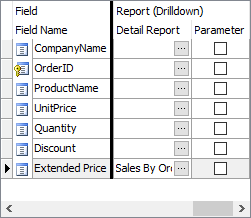
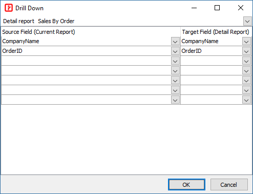
| Detail Report | If field value is displayed in a report, you can drill down by setting up a hyperlink linked to a detail report. To setup a detail report, click the "..." to open the Drill Down setup form:
Select a report as detail report, then select the parameters. Select Source Field from the current report and Target Field from the detail report. The report will then build hyperlinks for the field values to pass the selected field values from the current repor to the detail report. To make the detail report shows meaningful details, you need to pass the required parameters from the current report to the detail report. Select the field values you need to pass, make sure they are sufficient for selecting the relevant records in the detail report. See Tutorial - Drill Down Report. |
| Parameter | If checked, the current report can be used a detailed report and the selected field is a parameter.
Normally you do not need to manually enable this setting, after you set up detail report using the Drill Down setup form, PHPMaker will enable this for the required fields in the detail report. |
Report Settings
There are some more settings for report fields under the Edit Tag panel:
| Grouping Interval | If the field is Column Heading field in a Crosstab report and is of date/time type, this property sets the interval for the field values, possible value are:
If the field is a Grouping Level field in a Summary report and is of date/time type, this property sets the interval for the field values, possible value are:
If field is a Grouping Level field in a Summary report and is of string type, this property sets the interval for the field values, possible value are:
If field is a Grouping Level field in a Summary report and is of numeric type, this property sets the interval for the field values, possible value are:
|
| Year filter | If the field is Column Heading field in a Crosstab report and is of date/time type, and the Grouping Interval is Quarter or Month, this setting become available. If unchecked, quarters or months of different year in the report will be displayed together. If checked, a combobox for the available years will be added automatically to the report so user can select which year's data to display. |
| Delimiter Separated Values | If the field is stored as delimiter separated values (e.g. "value1,value2,value3") and you want to split them into separate values during searching, enable this setting.
Note By default, the values must be delimited by commas without spaces. |
| Relative Days | If Ext. Search is enabled and the field is of date/time type, this option add the following filters to the field in Extended Search:
Notes
To set up Extended Search with this filter, do the follows:
|
| Relative Day Periods | If Ext. Search is enabled and the field is of date/time type, this option add the following filters to the field in Extended Search:
Note See notes for Relative Days above.
|
| Relative Weeks | If Ext. Search is enabled and the field is of date/time type, this option add the following filters to the field in Extended Search:
Note See notes for Relative Days above.
|
| Relative Months | If Ext. Search is enabled and the field is of date/time type, this option add the following filters to the field in Extended Search:
Note See notes for Relative Days above.
|
| Relative Years | If Ext. Search is enabled and the field is of date/time type, this option add the following filters to the field in Extended Search:
Note See notes for Relative Days above.
|
| Past / Future | If Ext. Search is enabled and the field is of date/time type, this option add the following filters to the field in Extended Search:
Note See notes for Relative Days above.
|
| Date Interval | If Ext. Search is enabled and the field is of date/time type, this option displays the field in Extended Search as a combobox of date intervals. For example, if you select "Year", the combobox will only contain options of years, not options of dates. Possible date intervals are:
|
| Default Year | Default year for the Date Interval combobox. Enter full year (yyyy), e.g. 2008.
Note This setting can also be a valid PHP expression (e.g. a function) which returns the year, e.g. date('Y') |
| Default Quarter | Default quarter for the Date Interval combobox. Possible values are 1-4.
Note This setting can also be a valid PHP expression (e.g. a function) which returns the quarter, e.g. CurrentQuarter() |
| Default Month | Default month for the Date Interval combobox. Possible values are 1-12.
Note This setting can also be a valid PHP expression (e.g. a function) which returns the month, e.g. date('n') |
| Default Day | Default day for the Date Interval combobox. Possible values are 1-31.
Note This setting can also be a valid PHP expression (e.g. a function) which returns the day, e.g. date('j') |
Also See